10 Predictive Search Examples For Your eCommerce Site

As an eCommerce site owner, your site search is often one of the overlooked aspects.
However, when you improve the state of your site search, you get higher conversion rates, more shoppers, and happy shoppers because finding products on your store becomes easier.
How do you improve your eCommerce site search? There are many things you can do e.g. make your site search box standout, make results filterable, properly utilize keywords in product pages, etc.
In this post, we’ll be looking at one of the modern ways of improving your site search which is using Predictive Search.
I’ll be listing out 10 predictive search examples you can draw inspiration from.
What Is Predictive Search All About?
On Google search, you usually get search predictions and related keywords immediately you start typing in the search box.
That’s what predictive search is all about. Predictive search makes online search quicker by presenting search terms that could be what you’re searching for or related to.
Primarily, the search predictions that are displayed are based on similarity and popularity.
However, designers can customize search predictions based on several other factors. By clicking on a search prediction, you automatically search the term.
It’s a lot easier and faster for a person to read than type and this is the advantage that predictive search brings. Instead of having to type the entire search query, you can simply read through the search predictions and select an item.
This saves a lot of time considering that people carry out searches all the time.
For an eCommerce site, predictive search carries more advantages than simply saving time.
Customers might not be able to remember the full description of products – especially gadgets and electronics.
If your eCommerce site is built with platforms like WooCommerce, Shopify, or Magento, you can easily incorporate predictive search functionality by using plugins or third-party apps.
With predictive search, they can locate the correct description and spelling of products they’re interested in buying.
10 Predictive Search Examples For Your eCommerce Site
Manageable List (Amazon)
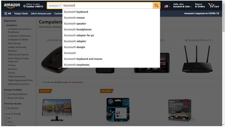
If you conduct a search on Amazon with your PC and then your mobile device, you’ll find that the PC search predictions are always more than that of the mobile device.
While the PC search predictions might be up to 9 or 10, the mobile site is limited to 5 or 6.
This is simply because the PC has a larger screen than the mobile device.
If the mobile site features up to 10 search predictions like the desktop site, the terms won’t fit on the screen – mobile phone keyboards take up almost half the screen.
A user would need to scroll down to see all search predictions which flaws the purpose of predictive search – to save time.
Therefore, what you should do on your eCommerce site is to limit the search predictions based on the device, so it’s manageable and ensures the best suggestions are featured first.
Highlight Active Search Prediction (Etsy)
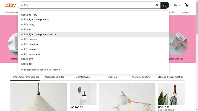
This is a common feature you’ll find on predictive search results for most eCommerce websites.
However, some sites still exclude it.
If you intend to incorporate predictive search on your eCommerce site search, ensure that you highlight the active search prediction just like Etsy.
This is very simple. When users search for terms and search predictions come up, the search prediction they intend to select should be highlighted when they hover their mouse on it.
Etsy uses a gray shade to highlight active search predictions, but you can go with any color that matches your site design.
Highlighting the active search prediction is important because it provides visual support to the customer.
They know what search term is active and thus will avoid searching for the wrong product. Without the highlight, it’s very easy for a customer to click something else.
For effectiveness, you must support keyboard navigation in your predictive search results.Readability (Walmart)
Readability (Walmart)
There’s no purpose in featuring predictive search in your eCommerce site when it is impossible for your customers to read the terms.
If your customers can’t read, then they cannot select the most appropriate search prediction.
When talking about readability, you have to consider the font size and line spacing.
This should be optimized for both mobile and desktop but most importantly for mobile.
An enormous font size would look awkward on mobile devices, and if the line spacing isn’t sizable, all the terms will appear joined.
Desktop devices have large screens so the words are likely to stretch out, unlike mobile where large font sizes may result in double lines.
Also, the desktop has the active search prediction highlight as an advantage so differentiating the search terms won’t be very difficult.
Another important aspect of readability is the font case. It’s easier to read the text in title case or lowercase like on Walmart.
Avoid featuring all uppercase text in your predictive search results.
Readability (Walmart)
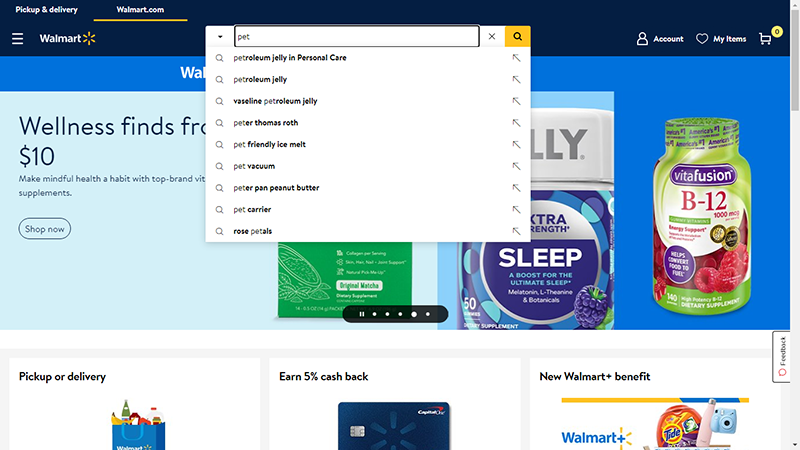
There’s no purpose in featuring predictive search in your eCommerce site when it is impossible for your customers to read the terms.
If your customers can’t read, then they cannot select the most appropriate search prediction.
When talking about readability, you have to consider the font size and line spacing.
This should be optimized for both mobile and desktop but most importantly for mobile.
An enormous font size would look awkward on mobile devices, and if the line spacing isn’t sizable, all the terms will appear joined.
Desktop devices have large screens so the words are likely to stretch out, unlike mobile where large font sizes may result in double lines.
Also, the desktop has the active search prediction highlight as an advantage so differentiating the search terms won’t be very difficult.
Another important aspect of readability is the font case. It’s easier to read the text in title case or lowercase like on Walmart.
Avoid featuring all uppercase text in your predictive search results.
Quick Query Removal (Amazon)
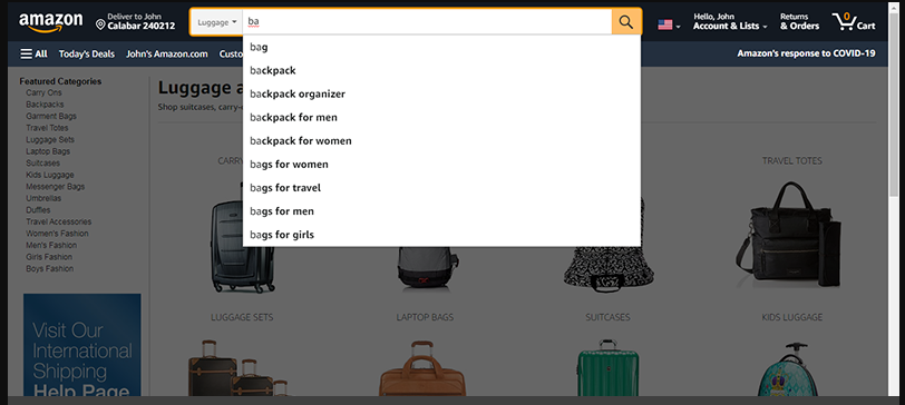
When customers carry out searches, they might change their mind and clear their input to type in a new one.
On Amazon, the featured search predictions are cleared just as the customer clears the previous input.
With everything cleared, the customer gets the original loaded page.
This is not the same for some other eCommerce websites that feature predictive search.
On these sites, search predictions are kept hanging even after a customer clears the search keywords.
As such, it’s difficult to disengage and return to the original page. It’s as though the predictive search results load on a different page.
To make it even easier for customers to clear queries, you can feature an “x” button beside the search button.
Featured Image (Costco)
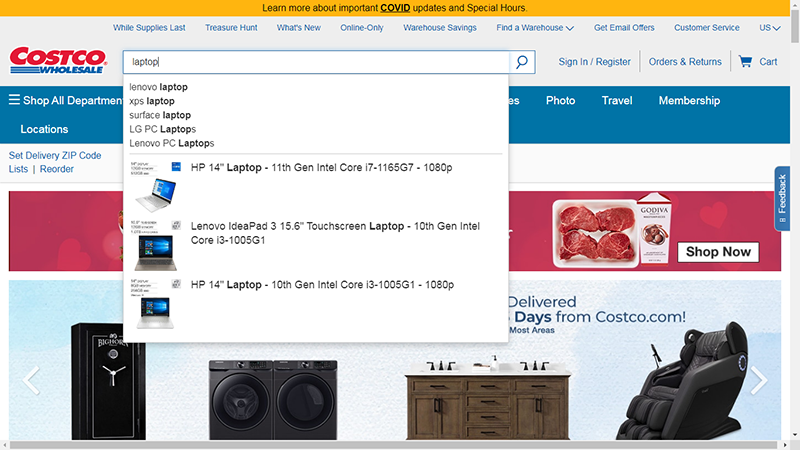
If you sell electronics on your eCommerce store, you can add a featured image to your predictive search results just like Costco Wholesale.
Like in the featured image, most of these electronics feature long descriptions with technical details.
Most of the time, customers don’t go too deep into these technical details.
They get convinced to buy a product from the appearance. Featuring product images in predictive search results save customers even more time.
Typically, they would complete the search to see all products that relate to the search term.
With the featured images, they can go directly to product pages instead of the results page.
Nevertheless, the results page is still important which is why like Costco Wholesale, the featured products and images should be limited; just three are featured.
Also, featuring product images in your predictive search is ideal for desktop alone; featuring it on your mobile site will make things complex. Moreover, no images are featured on the Costco Wholesale mobile site.
Feature Categories (Staples)
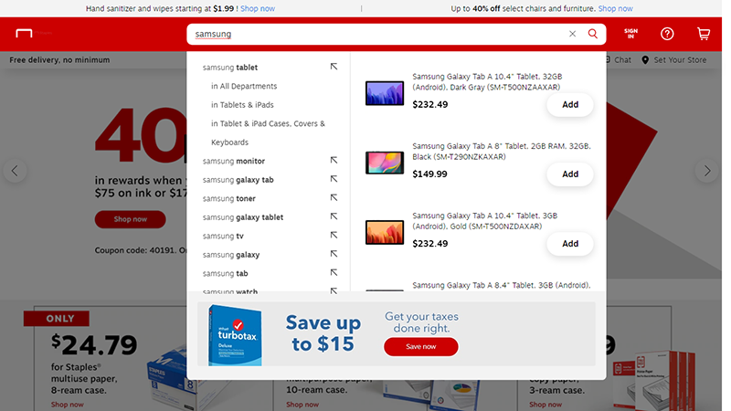
Some brands produce products in different categories. Take, for instance, the Samsung company produces mobile phones, laptops, TVs, refrigerators, etc. By featuring categories in your predictive search results, you get to properly direct customers to get what they want.
If you search for Samsung on Staples, you get the options to search for the search term in all departments, tablets, and iPads, cases, keyboards, etc.
By clicking on any product category, the customer is taken to a results page that features just that product.
This is beneficial when customers simply want to explore without having a particular product in mind.
There are several Samsung mobile phone models and if a customer wants to explore the options, they simply search Samsung and select phones from the predictive search result.
Generally, categorizing products gives a positive user experience.
Notwithstanding, the featured categories should be limited just like on Staples; the search prediction result shouldn’t list out all categories on your eCommerce store.
Use Synonyms (Google)
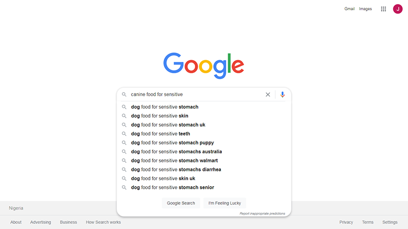
This isn’t a predictive search result example used by a lot of eCommerce sites but it has its advantage.
By using synonyms in your site’s predictive search, you can help customers find the products they are looking for, even if they search using different words.
This is more ideal when you feature some matched products in your predictive search results.
A customer might search for “canine food” which is the same as “dog food”.
Without synonyms included in your predictive search results, only products that carry the “canine food” keyword will be featured.
The best dog food product on your eCommerce store might not carry the keyword; hence, your customers will miss out on buying the best product.
Using keywords is also ideal to expand the predictive search queries. Customers may search for a product that you don’t have, but you may have something similar.
Rather than returning empty search suggestions, similar product search terms should be featured.
Visual Depth Design (Target)
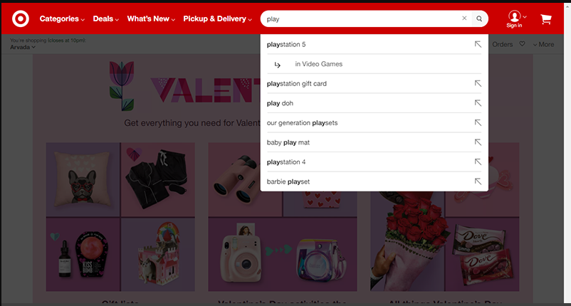
That’s the same thing you’ll achieve when you implement this predictive search example on your eCommerce site.
On the Target eCommerce website, when you search, a shadow is thrown on the page background.
As a result, your focus is completely drawn to the search queries.
There are lots of things on the page background that could distract a customer.
Elements like sliders, ads, etc. can easily make customers ignore the search predictions and completely type in their search query.
Without distraction, it’s easier for customers to explore the predictive search options and pick a related query.
However, this can only be implemented on your desktop site.
For mobile sites, you can simply present a full search page that features nothing but the search box and predictive search queries.
However, as earlier discussed, ensure it’s easy for customers to return to the original page by featuring an “X” back button.
Highlight Text Differences (Amazon)
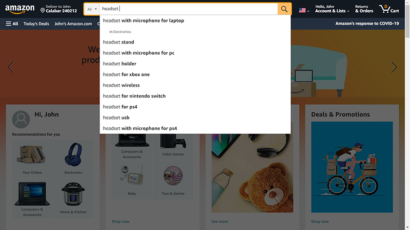
Some eCommerce sites don’t differentiate the keywords typed in by customers from the predictive search terms.
The entire predictive search terms are in plain text.
Other sites highlight the text that customers typed and leave the autosuggestions plain. For example, a customer types “dog” and the predictive search term reads “dog food for puppy”.
The text typed by the customer “dog” is highlighted (usually by bolding), while the auto-suggestion “food for puppy” is left plain.
This implies that the bolder text comes first and it could make reading somewhat complex.
It’s ideal to go with this Amazon example – highlight the predictive search term and keep the text typed by the customer plain.
From the previous example; instead of “dog” being made bold, the “food for puppy” should be instead. Besides, the customer will be familiar with their search intents and the predictive search terms.
If any section should be emphasized, it’s the predictive search term so that the customer can quickly notice it.
Feature Trending Search Terms (Target)
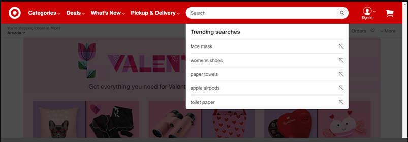
As mentioned earlier, the predictive search isn’t all about similar search terms. It also involves popular search terms.
Therefore, you can save your customers the stress of having to enter any keyword at all by featuring popular search terms by other customers.
On Target, once a customer clicks on the search box, five trending search keywords are featured.
Since the keywords are trending, it’s predictable that the customer wants to search for one of these keywords.
Featuring this predictive search result example in your eCommerce website will give you an edge in making navigation easy for your customers.
Most eCommerce products only feature trending products in their websites and not the keywords used in searching for them.
Nevertheless, if you opt for this predictive search result example, you must configure it properly.
You’ll have to set how the trending keywords are picked – from daily, weekly, or monthly search trends. The best to go with here is daily search trends.
Wrapping Things Up
It’s one thing to introduce predictive search on your eCommerce site and it’s another to get it right.
Without the right search predictions, you end up making the search process complicated for your buyers instead of simplifying it.
From the 10 predictive search examples discussed in this post, you should be able to identify ideal predictive search designs and interaction patterns to implement on your eCommerce sites.
